The full communication
package for
Van de Velde Packaging
Van de Velde Packaging has specialised in packaging and packaging machines for more than 80 years. It has grown impressively after a raft of successful acquisitions. The company needed a single recognisable concept to ensure consistent communication across all divisions and channels. Something that improves the brand’s visibility and findability in the market. A challenge simply made for our team!
Uniform communication
In a brainstorming session our strategists addressed the communication style together with the client. How does communication go today? What could improve? What’s missing?… Our concept creators got to work on the substance. A new overall concept rolled out offline and online gave Van de Velde a uniform communication style across Europe.
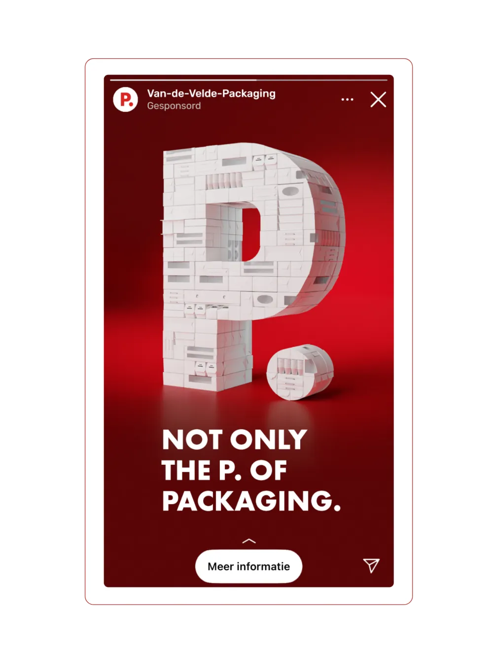
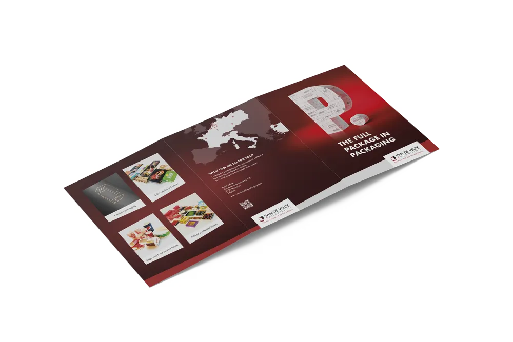
Single 3D concept
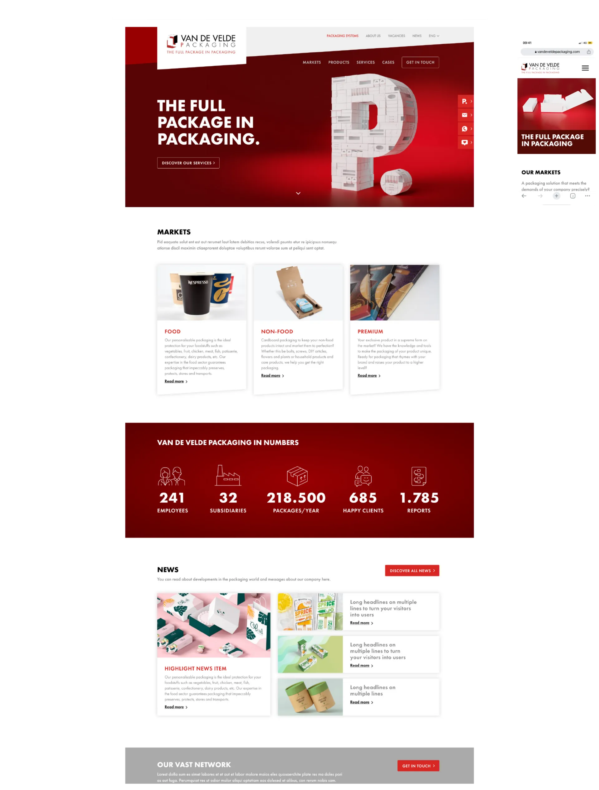
We drew inspiration for the concept from Pieter Van de Velde, the founding father of Van de Velde Packaging. The letter P is a central element in the logo and we kept it that way. It returns across all aspects of the branding, starting with the powerful image concept.
The P we designed in 3D is made up of all manner of packagings, and as such it stands for the company’s core business and its extensive range. We also use the P in the various USPs of Van de Velde Packaging: from Perfection and Power to Presentation.
The strapline ‘The Full Package in Packaging’ confirms that Van de Velde is your go-to for all your packaging needs. That includes the development of a complete custom packaging system, by the way. Talk about full service.
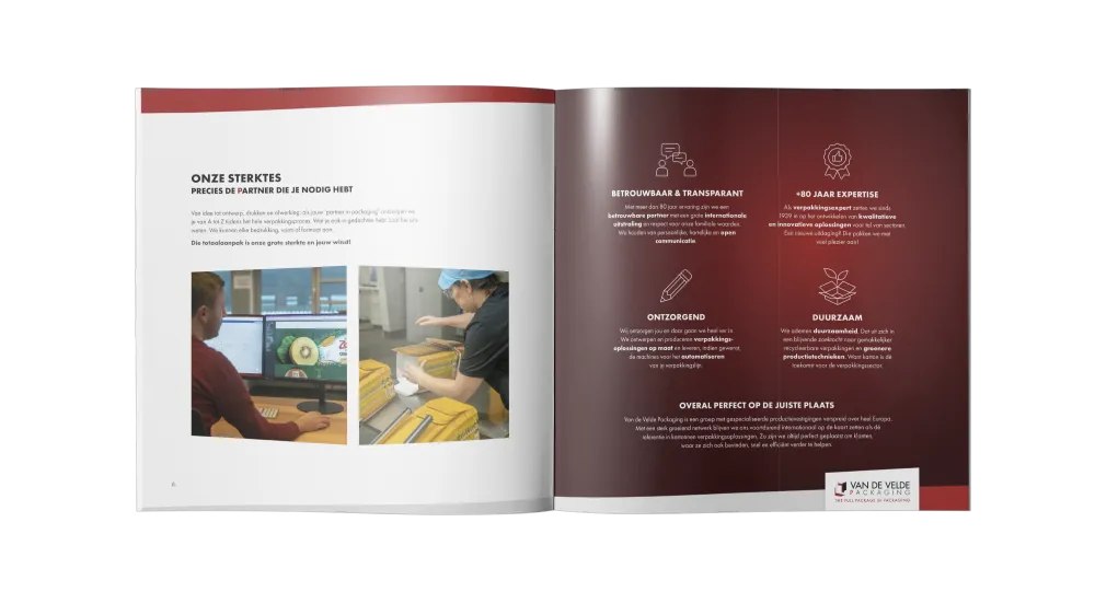
Offline rollout
Our designers outlined the new house style in a dedicated guide to ensure consistent communication going forward. It’s a repository of the dos and don’ts for designers setting out how to use the logo, what colours to use and other graphic design aspects.
We have already applied the new house style in various offline tools. These include fair communication, brochures and sales tools. We also provided photo and video materials, such as drone shots to add dynamism to the website and social media channels. The visuals were used both offline and online to clearly communicate the rebranding.
Future-proof website
Our developers have now produced a new Drupal website for both the packaging and systems divisions in no fewer than nine languages. The result is a powerful, future-proof international content platform whose main purpose is to generate leads.
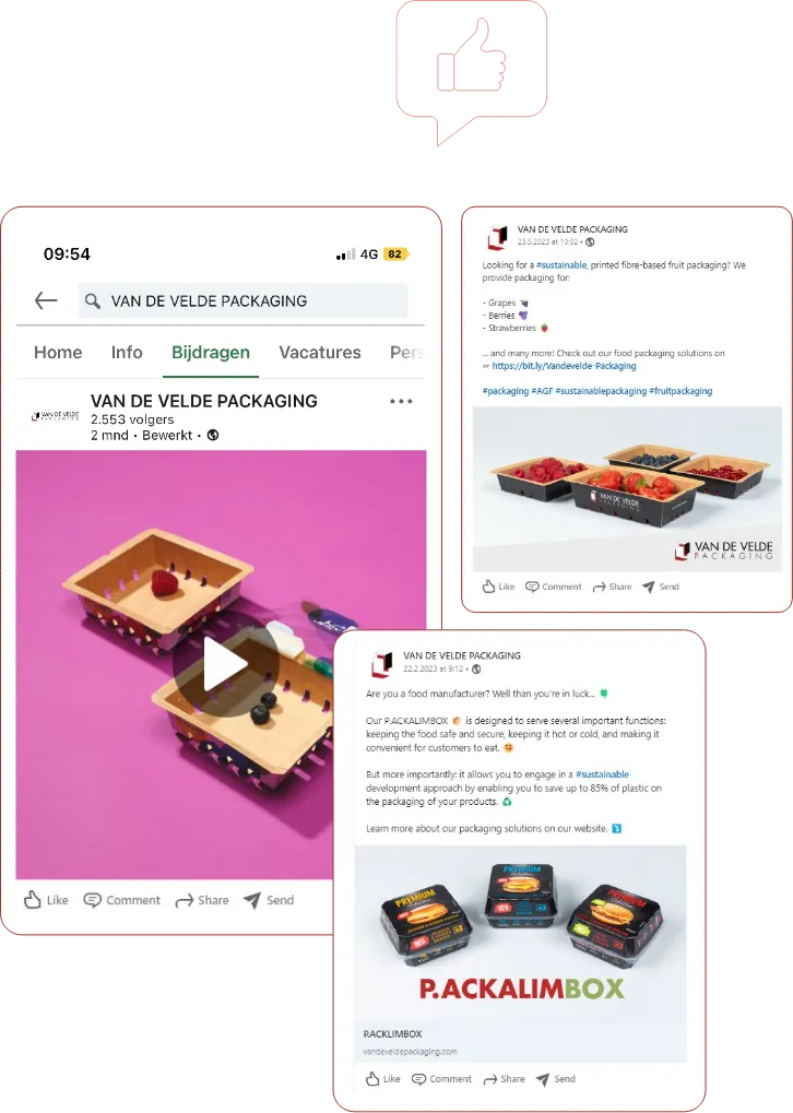
Online marketing
We also used the new concept online on the socials. Our marketers made a content calendar comprising various content clusters, such as PVF (potatoes, vegetables and fruit) and premium packaging. Based on that calendar we put together various types of creative LinkedIn posts in English.
Our digital marketers aimed each of the posts at the appropriate target audiences to drive broad-based brand recognition. Targeted communication? Check!
We also drew up social media guidelines with best practices for posts in terms of copy and design. That enables us to ensure that the new branding is used consistently across all media together with Van de Velde. Full-service communication with the P for Power up your brand!